Research · Product Design
Designing the foundation for improved analytics

Introduction
The goal was simple — use a series of small projects to deliver value to customers and improve the overall analytics experience in ControlCheck. With a built up backlog and a dedicated team to start digging in, our mission of building a more robust analytics experience was clear and we were eager to dig in.
Discovery
Getting started
We had a few key goals at the outset:
- Improve trust in existing metrics and IRIS’ (Individual Risk Identification Score) ability to identify true diversion
- Drive out inefficiencies in investigating providers
- Create a seamless, intuitive user experience
- Provide necessary contextual data for determining true diversion vs workflow issues
- Align and close diversion gaps to meet future market and product innovation needs
Our assumption was that we’d be successful if we saw:
- Increased engagement by user:account ratio of Analytics and individual metrics
- Increased true positive identification of diverters
- Decreased false positive rankings of providers
- Provide necessary contextual data for determining true diversion vs workflow issues
- Increased NPS of IRIS and Analytics
UX Rant
Let’s talk about NPS...
I have never personally been a huge fan of NPS to measure overall experience due to the many factors that can sway it (low number of respondents one month, lots the next for example) and it’s general unreliability. It’s a good indicator of perception but not necessarily a measure of the experience and whether it’s getting better or worse.
Because of this I set up SUPR-Q for the analytics section of the site with a clear plan. To get a baseline on the current experience, and then use SUPR-Q to give a better indication of whether we were actually positively impacting the experience or not.
Digging in on current use
After initial customer interviews, I noticed that many customers had a clear workflow they’d perform every time. They would start with one metric, review it, then go to the next metric, and so on. With the existing horizontal tab set up they were inadvertently running into a couple key issues:
Problems with the current Navigation
- The tabs were pushing important visualizations and data much lower on the page resulting in lots of scrolling up and down to find what they were after
- User would need to go back to the top of the page to find the next metric they wanted to look at, select it and then start all over
Design
Navigation 2.0
Navigation is one of those things that can be easily taken for granted, especially in an enterprise application. It’s easy to chalk it up to mandatory use and that user will just “figure it out” or easier to maintain the status quo. It was clear to me at first glance, that not only could the navigation use a little help with a visual refresh, but more importantly — that the way users were interacting with the content on the page was being negatively impacted by the poor tab layout.
Moving from horizontal to vertical
I explored a simple visual update to the horizontal tab structure, but quickly moved toward a side navigation pane. The navigation needed to support frequent jumps to different pages, and while a sticky top nav was an option it would have covered valuable information on the page.
I wanted to ensure the new navigation would enable users to quickly see where they were, navigate to a metric page easily, and quickly pivot to the next metric page if they needed to. And if the navigation was in the way, they could easily hide it to maximize the screen real estate and get to work.
The new navigation allowed important content to move back up the page, provide a clear indicator of what metric page a user was on, and quickly jump to a different metric page — without miles and miles of vertical scrolling.
Let’s talk about those filters
While the navigation may have been an unspoken issue, the filters definitely were not. Customers continually let us know that they were frustrated when working in IRIS because they would set a filter or group of filters, and then navigate to another metric page and have to define those filters all over again. They wanted a way to set the filters once, and then navigate between the metric pages and see the data with those filters applied.
Early wireframes for IRIS 2.0 filter explorations
Going global
I pitched the idea of having the most commonly used filters become “global” primary filters that could be set and persist across metric pages. Then the filters that were more connected to the data on the page itself (e.g. standard deviation) could live closer to the content to make a stronger connection between the filters and their impact.
Patience and persistence
The filters took almost a year to finally be implemented in ControlCheck, but along the way the filter work I started helped spur some incredibly important conversations within the design team and within other product teams as well. One of the other products was able to implement a single filter which ultimately acted as a proof of concept and lowered the overall risk of the ControlCheck team deciding to implement the filters. The filters also became one of the first shared components across products which became a great springboard for kickoff off a true enterprise-level design system.
Med Trends
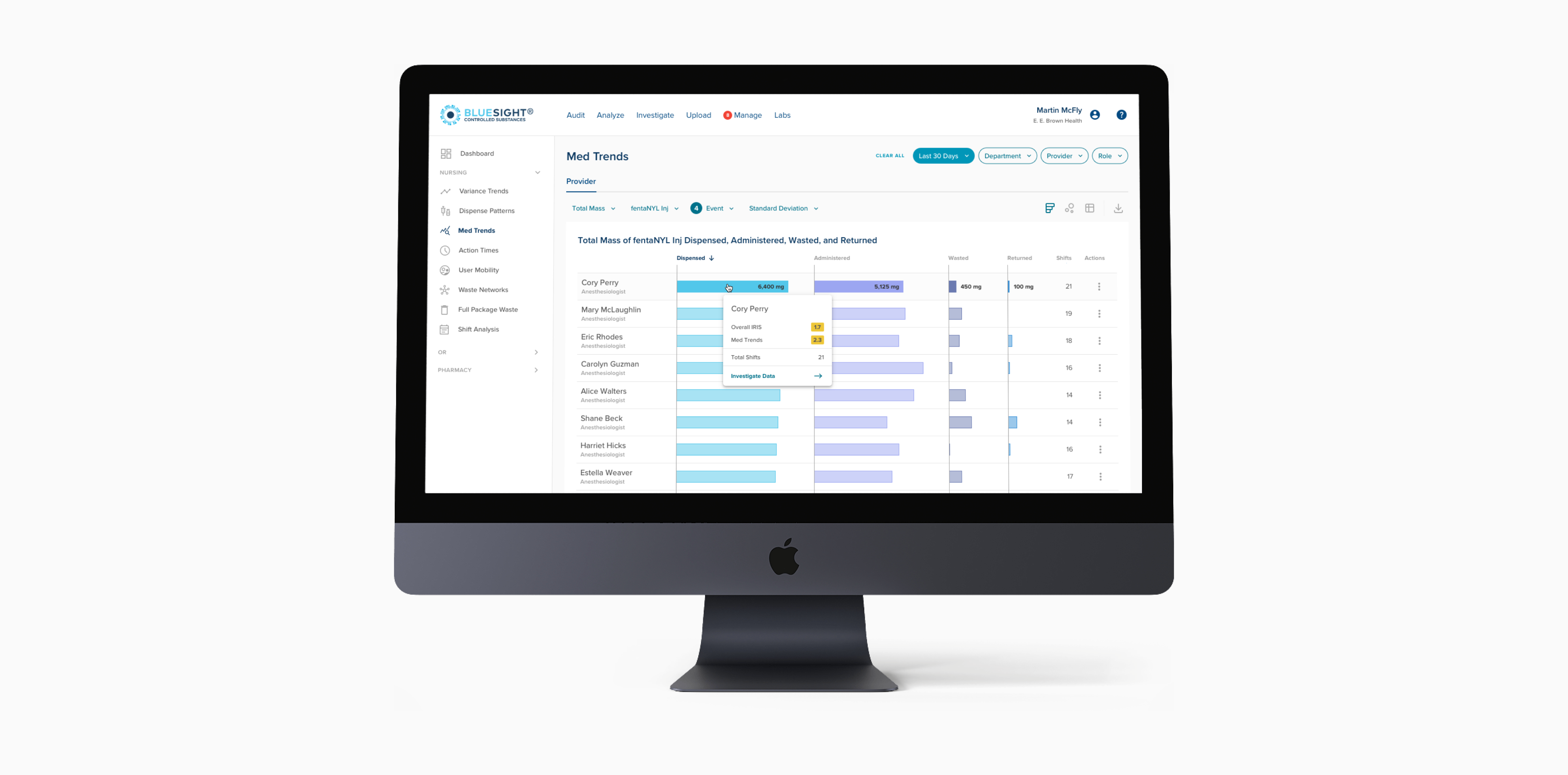
While the filter work was a much longer arc of refinement, and exploration in order to really dial things in, redesigning the Med Trends page was the swan song of the initial IRIS 2.0 journey. Redesigning the Med Trends page was one of my favorite pieces of work. The way we ran ideas through the monthly customer advisory group for regular feedback and validation and got buy in from engineering and data science was an amazing ride.
Original Med Trends page and navigation
Rethinking the scatterplot
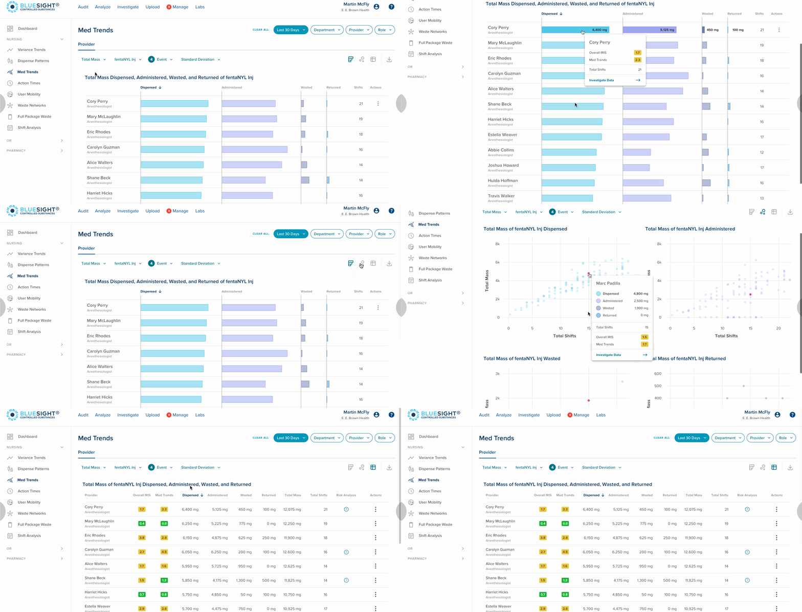
Initially I wanted to move away entirely from the scatterplot — my assumption was that it was overkill for customers. My aim was to give users a simplified, but still effective view of the data that was most valuable to them. While early iterations focused on lightweight UI alignments, later concepts gained stakeholder and customer buy in for longer term changes that would positively impact the entire analytic section. Ultimately we landed on a scalable design that defined layout and interaction patterns that future metric page updates would follow.

Establishing flexible patterns
The redesigned Med Trends page provided flexible visualizations and views of the data so users could dig in and really identify what was going on. Instead of a single scatterplot, users would have a default bar chart to easily compare providers. The updated scatterplot provided four connected views, providing deep insight at a glance. Hovering on a user in one scatterplot would highlight that same user in the other three. A tabular data view was available for a no-nonsense view, when a visual was too much or efficiency was critical.
Building for the future
The layout system and initial components were focused on the future of IRIS, ensuring we could revisit and refine existing metrics, and also ensure the design would scale as new data became available.
Reflection
Unfortunately this project was paused after a company acquisition and changing immediate priorities. While the Med Trends page didn’t ever make it out of Figma — this project did lay the foundation for many other changes in the application including much in the IRIS Worklist, and also the way the product team worked.
The filters that were part of IRIS 2.0 planted the seed for building an initial design system. The side navigation was built and became part of the IRIS to IRIS Worklist transition. Many of the other elements and design intent that were part of the IRIS 2.0 redesign also found there way into the rest of the ControlCheck application, even as the project was shelved.
I’m incredibly proud of the IRIS 2.0 work, yes in part for the work but also for the process. I love designing for data and finding the sweet spot between clarity and data density. It’s a particularly unique challenge that always pushes me to look at problems in different ways. The way a small team iterated and created a tight feedback loop with customers was nothing short of amazing. The Analytics Advisory Group was later revived as became a staple of future analytics design work.